User research evaluation Case study- heuristic evaluation and Usability
To get started, it is essential to understand user research as a method for gathering information and insights into consumer behaviors. With this information, we can improve the user experience of our products and services. This study focuses on the shopping experience of Namubak’s e-commerce website, using heuristic analysis and a usability study to identify and address crucial areas for improvement.
Overview
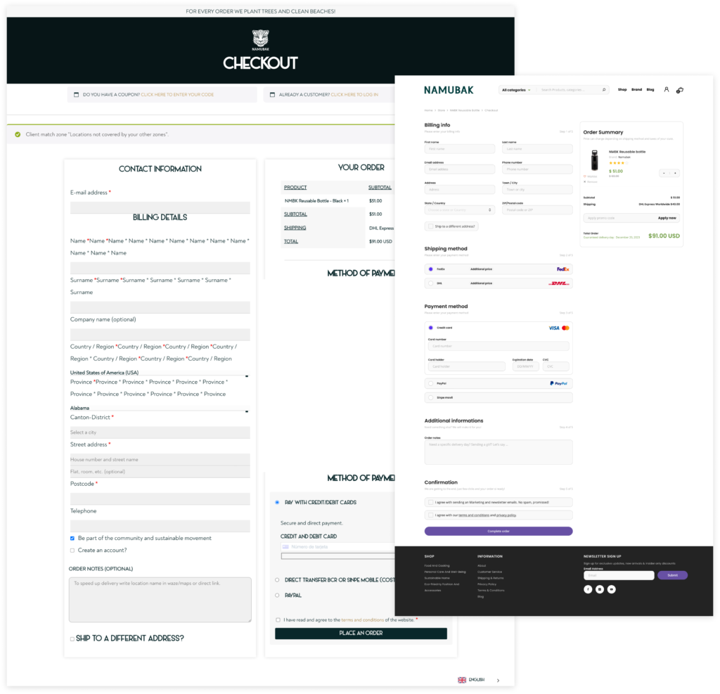
Namubak, an eco-conscious brand based in Costa Rica, specializes in apparel crafted from sustainable bamboo textiles. The brand, synonymous with an adventurous lifestyle, aims to elevate product sales on its e-commerce platform. However, the Namubak website has been grappling with significant usability challenges, especially on its checkout page. These issues range from poor visibility of system status to inconsistent design elements, culminating in reduced customer satisfaction and conversion rates. This case study explores the journey of addressing these challenges through targeted design solutions, aiming to create a more intuitive and user-friendly checkout experience.

Hypothesis
Redesigning the Namubak e-commerce website, particularly the checkout process, can help address several usability issues. These include inconsistent design elements, poor visibility of system status, and insufficient presentation of product information. By addressing these issues, we can significantly improve the ease of user navigation, decrease checkout completion time, and enhance overall user satisfaction. These enhancements are expected to result in higher client conversion rates and increased product sales for Namubak.


Usability research question
The checkout page in the Namubak e-commerce website has a lot of usability issues. These issues include inconsistent design elements and poor visibility of system status. Reduced client satisfaction and reduced conversion rates are the results of these problems. This research aims to increase product sales on the website by investigating how these usability obstacles impact the customer’s shopping experience and evaluating how well-suggested design solutions work to create a more user-friendly and effective checkout procedure.
- How easily can users navigate through the checkout process?
- Are there any points in the process where users typically need help or clarification?
- How long does it take for a typical user to complete the checkout process?
- Can users complete the checkout process with minimal effort and input?
Design of evaluation
Dependent variables
- Navigation ease: Degree of ease with which customers may go through the revised checkout procedure. This involves evaluating the checkout pages’ user journey and intuitiveness.
- Checkout completion time: How long does it take an average customer to go through the process? This is a numerical indicator of how effective the checkout procedure is.
- User satisfaction: The degree to which customers are happy with the checkout procedure.
Independent variables
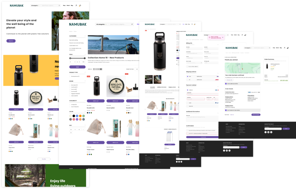
Current Namubak e-commerce website and updated Namubak website prototype
Participants
An interactive prototype will be designed and tested with 4 participants. This participant will be asked questions in different scenarios. Add a product to the cart and then proceed to buy that product. The users will go through the whole process of buying a product and then receive the feedback needed if something wrong happens.
https://www.figma.com/proto/NeiPTVgFiWwTF0mrrUSnI7/Heuristic-Evaluation?page-id=215%3A5455&type=design&node-id=216-7470&viewport=5239%2C1748%2C0.25&t=FjU4SxUc5elb6b4b-1&scaling=min-zoom&starting-point-node-id=216%3A7470&mode=design
Evaluation notes
The following action items have been identified to improve further user experience and functionality based on comments and insights obtained from the usability test done on the new Namubak e-commerce website:
1. Improve Search Functionality Action: Increase the visibility and efficiency of the search bar at the top of the homepage, ensuring consumers can rapidly find certain products.
2. Refine Product Filters Action: Review and optimize the product filters, including size, color, and brand filters, to ensure they appropriately represent product availability.
3. Standardize Product Image Sizing Action: Standardize the size of product photos to ensure they are properly proportioned and do not overpower the page layout.
4. Improve Notification Clarity Action: Redesign the messages for missing information during checkout to be more visible and straightforward, effectively leading consumers through the process.
5. Simplify Checkout Process Action: Simplify the checkout process by improving the layout and structure of information, especially around payment and shipping information.
6. Show Pickup or Delivery Options Action: Make it clear what options are available for product pickup or delivery, maybe through an explicit section during the checkout process or in product descriptions.
Conclusion
It is crucial to listen to users when developing effective and user-friendly websites. Our usability testing on Namubak’s old and new websites found significant areas for improvement. The prior site had issues with user experience, such as complicated navigation and imprecise information, which reduced user satisfaction. On the other hand, the new website provided a more straightforward and more accessible buying experience, resolving many of these problems.
The positive response to the new website highlights the importance of user-centered design and continual improvement. Namubak can significantly improve customer happiness and expand its reach by focusing on user demands and incorporating their comments. This study demonstrates that aligning with user preferences is not only advantageous, but also necessary for a successful online presence.
